
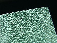

The Canadian currency tactile feature is a feature on the Canadian Journey and Frontier series of Canadian banknotes to aid people who are visually impaired to identify the notes. The feature indicates the banknote denomination in the upper left corner of the face side of the bill using a series of raised dots. It was suggested by Bruno Thériault, an administrator for the Canadian National Institute for the Blind, and designed by Susan Lederman, a professor of psychology at Queen's University.
Although similar in appearance to braille, it differs because standard Braille was deemed too sensitive. The currency denomination must be recognized easily, thus the banknotes use full braille blocks (or cells) of 6 dots, ⟨⠿⟩. The $5 bill has one cell, with the $10, $20, and $50 denominations each having one more cell than previous. The $100 bill has two cells arranged such that there is a space of two empty cells between them: ⟨⠿⠀⠀⠿⟩.
A very similar system of tactile raised dots is now being implemented in a new series of notes for the Costa Rican colón.
The U.S. Treasury has announced that the new $10 note will also have a tactile feature.
The tactile feature consists of symbols of six raised dots (two columns of three) separated by a smooth surface. The number and position of these six-dot symbols vary according to the denomination:
- $5 bill: one six-dot symbol
- $10 bill: two six-dot symbols
- $20 bill: three six-dot symbols
- $50 bill: four six-dot symbols
- $100 bill: two symbols separated by a smooth surface that is wider than that on the $10 note