

Mystery meat navigation (also known as MMN) is a form of web navigation user interface whereby the target of each link is not visible until the user points their cursor at it. Such interfaces lack a user-centered design, emphasizing aesthetic appearance, white space, and the concealment of information over practicality and functionality. The term was coined in 1998 by Vincent Flanders, author of the book and accompanying website Web Pages That Suck.
Terminology
The epithet "mystery meat" refers to the meat products often served in American public school cafeterias whose forms have been so thoroughly reprocessed that their exact types can no longer be identified by their appearances; similarly, the destinations of links using mystery meat navigation are unknown by appearance alone. Using such a navigation has been likened to processed meat products as "you're not sure what meat you've got until you bite into it". Flanders originally and temporarily described the phenomenon as Saturnic navigation in reference to the Saturn Corporation, whose company website epitomized this phenomenon.
Practice
The practice of mystery meat navigation may be defined as "frivolously concealing navigation options through rollovers and other tricks. It is considered problematic on information-rich websites because it makes it difficult for users to recognise the destinations of navigational hyperlinks, or to discern where they are, and this increases the time a user takes to learn to use the site.
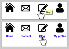
Website interface designers often decide to use iconographic navigation schemes as a way of reducing visual clutter and avoiding the need for language localisation. The exclusive use of icons without explicit labels in a website navigation may not be considered intuitive because it relies on the designer's personal understanding of the meaning of each icon. The provision of alt tags or tooltips which are revealed on mouseover are not considered a satisfactory solution, as these techniques only introduce an element of exploration that has been likened to minesweeping ("let's roll over everything and see if any surprises pop up"). This practice has been identified as a common anti-pattern in interactive design. Technology writer Shelley Powers also notes that MMN often relies on JavaScript, and that this can be detrimental to usability if a browser's scripting is disabled, and to search engine optimization.
Flanders writes, "The typical form of MMN is represented by menus composed of unrevealing icons that are replaced with explicative text only when the mouse cursor hovers over them".
"Click here"
Some technology commentators consider that the use of the popular phrase "Click here" as link text is a type of mystery meat navigation. It is thought to be problematic because the phrase does not indicate the content of the link target, which confuses the user.
The W3C's Web Content Accessibility Guidelines, as well as organisations such as WebAIM, recommend against the use of phrases such as "click here" as link text. According to the W3C, "Good link text should not be overly general; don't use 'click here.' [...] link text should indicate the nature of the link target". The text should also make sense when read out of context.
Furthermore, the phrase is inappropriate for users who are not using a mouse to navigate, e.g. using a keyboard or a touchscreen device. It also presents particular difficulties for blind and visually impaired users who make use of screen reader software that reviews a list of available links on a page. Pages would also suffer when printed. A further disadvantage given is that it hinders the search engine optimisation of a page.